
Color Theory Edu………..
Color theory education is the study and teaching of how colors interact, communicate, and influence human perception, emotion, and design. It combines scientific principles, artistic practices, and psychological understanding to help individuals use color effectively in creative, educational, and professional environments.
Color theory education teaches learners how to understand, organize, and apply colors through systems such as the color wheel, color harmony, contrast, value, saturation, temperature, etc. It also explores how color affects mood, behavior, communication, branding, learning, and visual perception.
So when you ask, What is Color Theory Education? Just read our brief explanation here
Intro to Color Theory
Color theory is the study of how colors interact, combine, and influence human perception, emotion, and communication. It provides a structured framework that artists, designers, educators, marketers, architects, and scientists use to understand and apply color effectively in both visual and practical environments.
At its foundation, color theory explains the relationships between colors through systems such as the color wheel, color harmony, contrast, temperature, balance, and more. These principles help individuals create visual compositions that are aesthetically pleasing, emotionally expressive, and visually functional to general audience beside or set aside the artists taste and creator.
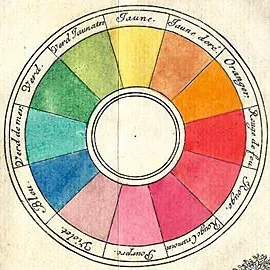
One of the most recognized tools in color theory is the color wheel, a circular arrangement of colors that demonstrates the relationships between primary, secondary, and tertiary colors. The wheel helps identify harmonious color schemes such as complementary, analogous, triadic, and split-complementary combinations. Learn more
The Science of Color Persection
Color perception is the process by which the human eye and brain detect, interpret, and assign meaning to visible light. Although color appears to exist naturally in objects, color itself is not physically present in the world as humans experience it. Instead, color is a perceptual response created by the brain when light interacts with the eyes and nervous system. Visible light is part of the electromagnetic spectrum and consists of different wavelengths. The human eye can typically detect wavelengths ranging from approximately:700 nmShorter wavelengths are generally perceived as violet and blue tones, while longer wavelengths appear as red and orange tones. When light strikes an object, some wavelengths are absorbed while others are reflected. The reflected wavelengths travel into the eye and determine the color humans perceive. For example, a red apple appears red because it reflects red wavelengths while absorbing most other colors in the visible spectrum. Learn moreThe Color Wheel
The color wheel is one of the most important visual tools in color theory. It organizes colors in a circular format to illustrate the relationships between hues and to help identify harmonious color combinations. Artists, designers, educators, and visual communicators use the color wheel to create balance, contrast, emphasis, and emotional impact within visual compositions.The modern color wheel originated from the experiments of Isaac Newton, who arranged the visible spectrum into a circular diagram after studying the refraction of light through a prism. Over time, the wheel evolved into a practical system used in both traditional art and digital design.The color wheel is typically divided into three categories: Primary, Secondary, and Tertiary, also it shows warm and cooler colors, tint, tone, shade, and more importantly the harmonious color schemes are displayed to teach and be use them in your paint project, artwork, day to day fashion, selecting color combinations for home painting and decor.
The Psychological and Emotional Impact of Color
Color has a powerful influence on human emotions, behavior, perception, and decision-making. Beyond its visual function, color acts as a psychological and emotional language that communicates meaning, creates atmosphere, and shapes human experience. The study of how color affects thoughts and feelings is often referred to as color psychology.
Although emotional responses to color can vary depending on culture, personal experience, and context, certain color associations are consistently recognized across many societies. Designers, marketers, educators, filmmakers, and artists use these psychological effects intentionally to influence mood, attention, and behavior.
Learn more
Cultural Interpretations of Color
Color carries powerful cultural meanings that extend far beyond visual appearance. Across different societies and historical periods, colors have been used to symbolize beliefs, emotions, traditions, social status, spirituality, politics, and identity. Although some emotional responses to color may appear universal, many color meanings are shaped by cultural experience and social context.
Understanding cultural interpretations of color is essential in art, education, branding, marketing, fashion, architecture, and global communication. A color that communicates positivity in one culture may carry a completely different meaning in another. Learn moreColor Harmonies
Color harmony refers to the arrangement of colors in a visually pleasing and balanced way. Harmonious combinations guide visual attention, create emotional tone, and improve aesthetic unity.Complementary HarmonyComplementary colors are positioned directly opposite each other on the color wheel.Their relationship can be represented geometrically as: 180∘ Examples include:Red and GreenBlue and OrangeYellow and Violet
Complementary harmonies create strong visual contrast and high visual energy. They are frequently used in advertising, branding, sports uniforms, and designs that require emphasis or attention. Learn moreColor in Art, Design, and Branding
Color is one of the most powerful elements in visual communication. In art, design, and branding, color is used not only for decoration but also to convey meaning, create emotional connections, guide attention, and establish identity. Through intentional color selection, creators can influence perception, communicate messages, and shape audience experiences.
Throughout history, artists and designers have used color as a visual language to express emotion, symbolism, hierarchy, and atmosphere. In modern society, businesses and organizations also rely heavily on color to build recognizable brand identities and influence consumer behavior.
Color in Art
Artists use color to communicate emotion, depth, movement, realism, and symbolism. German Cerrato author of The Meaning and Applications of Colors in Business, Graphic, Art, and Color Theory explains in detail the use and application of 12 popular colors. Learn more
Educational Applications of Color Theory
Color theory plays a significant role in education by improving communication, enhancing learning environments, supporting memory retention, and increasing student engagement. Educators, instructional designers, curriculum developers, and visual communicators use color strategically to organize information, guide attention, and create meaningful learning experiences.
Because humans process visual information rapidly, color becomes an effective educational tool that helps learners interpret, categorize, and remember content more efficiently. From classroom materials to digital learning platforms, color theory supports both cognitive and emotional aspects of education.
Color as a Learning Tool
Color helps learners identify patterns, relationships, and hierarchy within information. Educational materials that use color effectively are often easier to understand and navigate than materials that rely only on text. learn moreComposition and Principles of Design in Color Theory
Introduction
Color theory is closely connected to the principles of design because color influences how viewers perceive structure, movement, balance, and emotion within a composition. Designers and artists use these principles to organize visual elements effectively, creating works that are aesthetically pleasing, functional, and emotionally engaging. Understanding composition and design principles helps explain why certain color arrangements feel stable, dynamic, unified, or attention-grabbing.
What Is Composition in Design?
Composition refers to the arrangement of visual elements within a design, artwork, or space. These elements may include color, shape, texture, line, typography, and imagery. Good composition guides the viewer’s eye naturally and creates clarity, organization, and emotional impact.
Color plays a major role in composition because it can: Direct attention, create contrast, establish mood, organize information, add unity and rhythm.
Rhythm
Rhythm in design refers to the repetition or pattern of visual elements that create a sense of movement and flow. Similar to rhythm in music, visual rhythm guides the viewer’s eye through a composition.
Color contributes to rhythm by repeating hues, values, or color intensities throughout a design.
Types of Rhythm
Repetition: Repeated colors or shapes create consistency and familiarity. Example:
The image on the left consists of rhythmic pattern throughout her face, giving a sense of movement.
Alternation: Alternating colors or patterns create variety and movement. Example:
Alternating warm and cool colors in a pattern can create visual excitement.
Progression: Colors gradually change in value, saturation, or hue. Example:
A gradient transitioning from light blue to dark blue creates a progressive rhythm.
Flowing Rhythm: Curved lines and organic color transitions create smooth visual movement.
Example:
Nature-inspired paintings often use flowing rhythm through soft color blending.
Importance of Rhythm
creates movement, prevents visual boredom
Guides eye direction, establishes visual continuity.
Balance
Balance refers to the distribution of visual weight within a composition. Color strongly affects balance because bright, saturated, warm, or dark colors often appear visually heavier than softer or lighter colors. A balanced design feels stable and comfortable to the viewer.
Types of Balance
Symmetrical Balance
Both sides of a composition are mirrored or equally weighted. Characteristics:
Formal, stable, organized, traditional.
Example: A logo with equal color placement on both sides. Image to the left.
Asymmetrical Balance
Different elements balance each other without exact symmetry.
Characteristics: Dynamic, modern, energetic.
Example: A large neutral-colored object balanced by a smaller bright-colored object.
Radial Balance
Elements radiate from a central point.
Example: Mandalas, circular patterns, or color wheels. Designers use balance effects to control equilibrium within a composition.
Scale
Scale refers to the size of objects in relation to each other and to the overall composition.
Color affects perceived scale because certain colors can make objects appear larger or smaller.
How Color Influences Scale
Warm colors tend to advance and appear larger.
Cool colors tend to recede and appear smaller.
High-contrast objects seem more prominent.
Light colors may visually expand spaces.
Dark colors can make spaces feel smaller or more intimate.
Applications of Scale
Interior Design
Light wall colors can make small rooms appear larger.
Graphic Design
Large bright elements immediately attract viewer attention.
Fashion Design
Dark clothing colors often create a slimming visual effect.
Harmony
Harmony refers to the pleasing arrangement of visual elements. In color theory, harmony occurs when colors work well together and create unity.
A harmonious design feels complete and visually satisfying.
How Color Harmony Is Achieved
Through harmonious color schemes such as:
Analogous, complementary, split-complementary
triadic, tetradic, monochromatic
Characteristics of Harmonious Designs
Unity
Consistency
Visual comfort
Organized appearance
Harmony vs Contrast
Harmony creates unity, while contrast creates interest. Effective design usually combines both principles.Proportion
Proportion refers to the relationship between the sizes of elements within a composition. Color can enhance proportion by emphasizing certain areas or minimizing others.
Good proportion creates harmony and realism.
Examples of Proportion in Color
Large neutral backgrounds with small bright accents
Dominant primary color supported by secondary colors
Color hierarchy in user interface design
The 60-30-10 Rule
One of the most common proportional guidelines in color design is the:
60% dominant color
30% secondary color
10% accent color
This principle creates visual balance and prevents overwhelming color combinations.
Example:
A room may use:
60% beige walls
30% brown furniture
10% blue decorative accents
Emphasis
Emphasis refers to creating a focal point that captures the viewer’s attention first.
Color is one of the strongest tools for emphasis because contrast naturally draws the eye.
Methods of Creating Emphasis with Color
Contrast
Using opposite colors or extreme light-dark differences.
Example:
A bright red button on a neutral gray website.
Isolation
A single bright color surrounded by muted colors.
Saturation
Highly saturated colors attract more attention than dull colors.
Temperature Contrast
Warm colors stand out against cool backgrounds.
Importance of Emphasis
Directs viewer attention
Highlights important information
Improves communication
Creates visual hierarchy
Contrast
Contrast refers to the difference between visual elements. It enhances readability, visibility, and visual excitement.
Color contrast can occur through:
Hue
Value
Saturation
Temperature
Examples
Black text on white background
Warm orange against cool blue
Bright colors against muted neutrals
Importance of Contrast
Improves readability
Creates emphasis
Separates elements
Adds energy and drama